If the first part of our journey looked at why digital spaces need to embrace more warmth, care, and emotional richness, this next part turns to the how. To understand what this shift might look like, we can start with the most tangible examples—the physical environments we inhabit every day. Interior design has long understood that shapes, colors, and textures influence not just how we view a space, but how we feel and behave within it. And these same principles apply just as powerfully in the digital world.
Shapes, Colors in Interior Design
Research shows that the shapes and colors around us impact our emotions and actions.
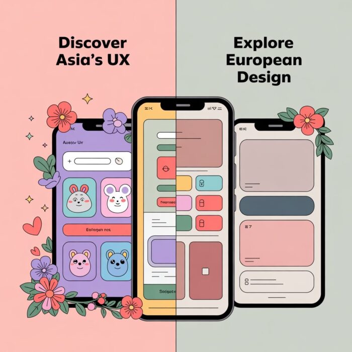
- Human brains see curved shapes as safer and friendlier. In contrast, angular shapes can trigger feelings of threat and tension. Implicit test shows that even children prefer curves over sharper forms.
- Multiple studies and reviews suggest that rounded shapes—like circles—are consistently perceived as warm, soft, and friendly. Angular or squared shapes, however, tend to convey impressions of competence, rigidity, or harshness.
- Softer, warmer tones such as pastels and pinks create comfort and intimacy. In contrast, rigid neutrals and bright colors can feel sterile or corporate.
That explains why new places like Melrose Kitchen and Dream’s Doughnuts catch the eye in European cities. They use pastel colours, curvaceous furniture, soft lighting, and playful décor that contrasts with the surrounding architectural minimalism. They provide a warm, inviting energy that fosters emotional connection.
From Interior Design to UX/Conversion Psychology
Physical and digital environments work by the same principles. Both inform your mental state, which, in turn, shapes how you move through those environments and interact with them.
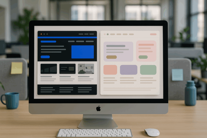
- Apple's design ethos: It's minimalist and restrained. Yet, Apple adds smooth corners, soft gradients, subtle shadows, and human-centred animations. These elements create a sense of emotional ease. The interface feels “feminine.” It’s approachable and gentle, even with a simple color scheme. A softly shaped, pastel space encourages exploration, connection, and resonance - they help reduce anxiety and boost creativity. That’s why designers and creators often pick Apple products.
- Windows/Office has a sharp, angular look. The high contrast and grid layouts suggest functionality and precision. This design feels structured, reflecting a masculine visual style. A clean, simple space boosts alertness, skill, and discipline. That’s why many managers and IT specialists tend to prefer Windows-based tools: they emphasize control, standardization, and centralized administration, which align with workplace priorities like security, scalability, and order.
UX logic That Outlives Its Usefulness
CRO often pushes for aggressive optimization at the expense of emotional nuance.
Feminine-coded design focuses on softness, intuitiveness, and empathy. Some say it's "inefficient" in CRO terms and can feel too subtle for quick conversions.
 But what if the goal isn’t speed, but resonance, trust, and long-term commitment?
Certain 'feminine-coded' aesthetics consistently promote emotional connection and engagement.
Here's how they impact UX and conversion:
- Rounded shapes → Comfort, longer dwell time
- Pastel/warm tones → Lower cognitive load, higher trust
- Organic layouts → Intuition over structure, encourages exploration
- Emotional micro-interactions → Builds connection, not just clicks
- Gentle onboarding flows → Supports decision-making, not just speed
- Emotional copywriting → Acknowledges vulnerability, not just confidence.
UX/UI and CRO experts need to rethink what success looks like and move beyond traditional masculine standards. This will help create inclusive and high-performing digital experiences.
Testing should consider gender and neurobiological diversity rather than just age or location.
- Building for rhythms and relationality, not just frictionless flow.
- Reclaiming feminine-coded astatic as strategic, not decorative.
- Rethinking KPIs: Is conversion the only metric, or do we also care about how users feel after clicking?
 We should acknowledge that:
- Rounded corners are not weak—they’re emotionally aware.
- Pastel tones are not childish—they’re comforting.
- Smooth transitions and soft micro-interactions are no less professional—they’re more human.
- Longer and more exclusive user journeys are not boring or tiring – they create deeper commitment and decrease the anxiety of purchase.
Feminine-coded design isn’t just a theory—it becomes a strategic advantage that wins in practice. It shapes our favorite apps that we love for being places we don’t want to leave:
- Canva – replaced the intimidating complexity of traditional design tools with something cheerful, accessible, and empowering. It feels like a creative playground where anyone can design equally appealing and understandable for all genders and ages.
- Notion – took away cold project management tools and gave us a warm and open “digital sanctuary”.
- Pinterest – replaced cold shopping list with soft and inspiring image-first layout. It turned transactional buyer experience into a personal and intuitive journey, encouraging dreaming and exploring, not rushing or buying.
All this proves that design can be beautiful and effective, emotional and functional at the same time.
Sources:
JUX/How Rounded Aesthetic Translates Beauty to Function and Prosociality: The Persuasive Effect of Warmth
Rounding for Warmth, Angling for Fluency: How Shapes, Cognitive Load, and Privacy Risk Influence App Adoption
PMC/Simple geometric shapes are implicitly associated with affective value
The Girl/The psychology of shape in visual communication :
Designmodo/Design Stereotypes: Masculine and Feminine Design Techniques
ResearchGate/Colour in product design and its influence on User Experience (UX) and Usability (US): a cross-sectional study
ResearchGate/Colors and Trust: The Influence of User Interface Design on Trust and Reciprocity
Images: Unsplash 1, 2, 3 & ChatGPT